🏢 Personal Intranet
I possess an immense dislike for browser new tab pages.
Thanks Chrome, but I'm really not interested in having that webpage I visited once pinned to my homepage...
Yes, Firefox, that article looks *amazing*, but I'd rather gouge my eyes out than read it!
For the last few years, I've had my own intranet (or start page, as most people would refer to it).
It gives me a quick and easy way to jump to a certain website or service, without having to trawl through bookmarks and quick links.
It's changed a few times over the years...
Version 1
Version 1 was a clone of my school's intranet. It was a pretty basic affair, but it worked!
It was hosted locally on my main-system, using IIS to serve the content.
This was OK, however it had a couple of issues:
- It wasn't mine - I felt uneasy at using somebody else's program, especially as the code for this page was a mess. Several thousand lines long, it had hundreds of features that the school used which were overkill for me.
- I couldn't access it reliably on mobile, and it looked awful on a small screen.
- Setting up the DNS so that I could access the site at https://intranet/ was a pain!
However, what really pushed me away from this was the expiration of the SSL certificate. I couldn't be bothered to go through the process again, so I binned the entire system. Seems reasonable to me!
Version 2
I'd been toying with the idea of building my intranet from scratch for a while. I wanted to use this as an opportunity to learn, so I set about designing and building version 2 from the ground up.
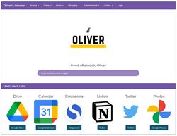
After a couple of weeks of design and coding, I had this:
Recognise the colours?!
This new system was lightyears ahead of the previous one:
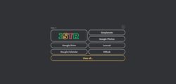
It integrated with my home network, displaying its current status right on the homepage, and it was also equipped with a fully working dark mode:
However, version 1 had far more space for links (all of the dropdown menus at the top), whereas this system could only really provide space for 6 sites...
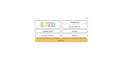
I created a second page, accessible using the double-width 'View all...' button on the homepage, however this initially was a bit of a bodge:
It was similarly low-capacity, and I found it pretty ugly...
Aside from this, this version was excellent!
It displayed excellently on mobile, was even accessible at school, and didn't require my computer to be turned on (thanks Netlify!)
However, I wanted to have another go at the bookmarks page. Onwards, to V2.5!
Version 2.5
Almost a year after introducing V2, I came back to my intranet. I'd made a few minor adjustments, but nothing particularly major, and it was time for an overhaul.
Many of the changes in this version were behind the scenes.
Previously, the intranet had been made up of static HTML & CSS files.
With this version, I updated it to use the 11ty SSG system I now use everywhere else.
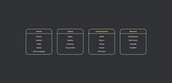
However, the major change came in the form of a redesigned bookmarks page:
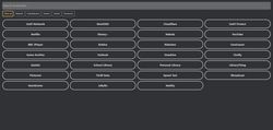
While also lacking in beauty, this page makes up for it in features! (I'll be working on the UI over the next few weeks...)
Each link is stored in an Airtable sheet, allowing me to quickly add new sites, without having to dive into the code.
As well as this, it has a search system as well as category filters, making it easier for me to find a particular link.
Version 3?
While I am happy with version 2, I have a few things I'd like to improve:
- The code for the homepage is an absolute mess, and although I could tidy it up pretty easily, I'd rather start from scratch. Seeing a theme?!
- The style (and shade of grey) I used in the dark mode are a bit eugh. Ideally, I'd align the intranet style to be closer to this site's.
- Version 2 wastes a lot of space, so this could also be improved.
June 2023